

A Thousand Ermines
Author Stéphane Hervé, graphic designer, collector of wooden typefaces, and founder of MetaGraphic, a design studio and typography workshop based in Carhaix.
Publisher Yoann De Roeck
The Life of a Symbol
There are some symbols that we eventually stop noticing because they blend so seamlessly into their surroundings. In Brittany, the ermine appears on restaurant menus, clothing stores, sports club merchandise, sardine tins, and craft beer labels… Institutions, associations, businesses, and individuals alike embrace it, each designing it according to their own taste.

Fig. 1 — Mosaic showing, for informational purposes, the ermine in its diverse forms and uses.
Unlike a logo, the ermine is a symbol that belongs to no one. It therefore belongs to everyone. Whether faithful to its historical form or entirely reimagined, the ermine retains its power of instant evocation: its few lines are enough to say “Brittany.”
Birth of a Glyph
Appearing in the Middle Ages, the ermine emblem was initially a heraldic fur. The trilobed symbol we know today does not represent the animal itself, but the black tip of its tail, which is scattered across a cluster of white pelts, forming a cloak prized by the powerful. Over time, this symbol was simplified into a silhouette composed of a long foot, surmounted by three stylized clasps.


Fig. 2 — Based on drawings by Raffig Tullou published in "Les véritables armes de Bretagne" (The True Arms of Brittany), Skoed evit hor bro, no. 08, 1985.
Repeated at regular intervals, this motif forms what is called the plain ermine: a white field strewn with black spots arranged in a quincunx pattern, intended to cover the entire surface of the shield.

Fig. 3 — The Duke of Brittany in the Grand Equestrian Armorial of the Order of the Golden Fleece, circa 1429-1461, folio 69r (Bibliothèque Arsenal, Ms 4790); The Grandes Heures of Anne of Brittany, 1503-1508, folios 3 and 1v (BnF, Ms lat. 9474).
In the 13th century, the Dukes of Brittany adopted this fur in their coats of arms. Under Peter Mauclerc, it appeared as a quarter of the blazon (a canton); a few decades later, John III made it the sole motif of his shield, thus asserting a distinct identity for the duchy, in direct competition with the gold fleurs-de-lis on a blue background that represented the Kingdom.
Beyond its political significance, the ermine already possessed all the qualities of an excellent "pictogram." Semi-figurative in form and with an elementary construction, its silhouette is easily memorized (because it is anthropomorphic); in short, it is easy to reproduce and adapt. It is this effectiveness that allows it to leave heraldry and gradually permeate all areas of visual culture.
From Coat of Arms to Pictogram
After Brittany's annexation to the Kingdom of France in 1532, the ermine retained its role as a territorial emblem while appearing on new media: tokens, frontispieces, almanacs, publications, and, later, signs and trademarks.
 Fig. 4 — Token of the Estates of Brittany, 1655. Collection Musée de Bretagne, photo: Alain Amet.
This widespread use profoundly altered its status. Used alone, outside of heraldic patterns, the ermine ceased to be a motif and became an autonomous symbol: its great formal economy and evocative power made it a formidable symbol.
Printing accelerated this evolution. Engravers and founders constantly adapted its design to the constraints of their techniques. Each workshop offered its own interpretation, simplifying an outline, modifying a clasp, or rebalancing a silhouette, without ever altering its recognizability.
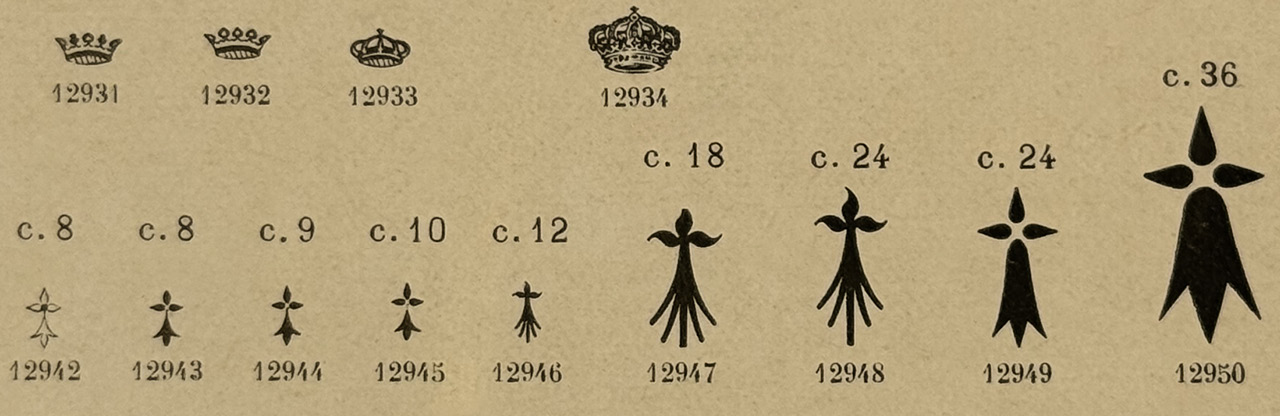
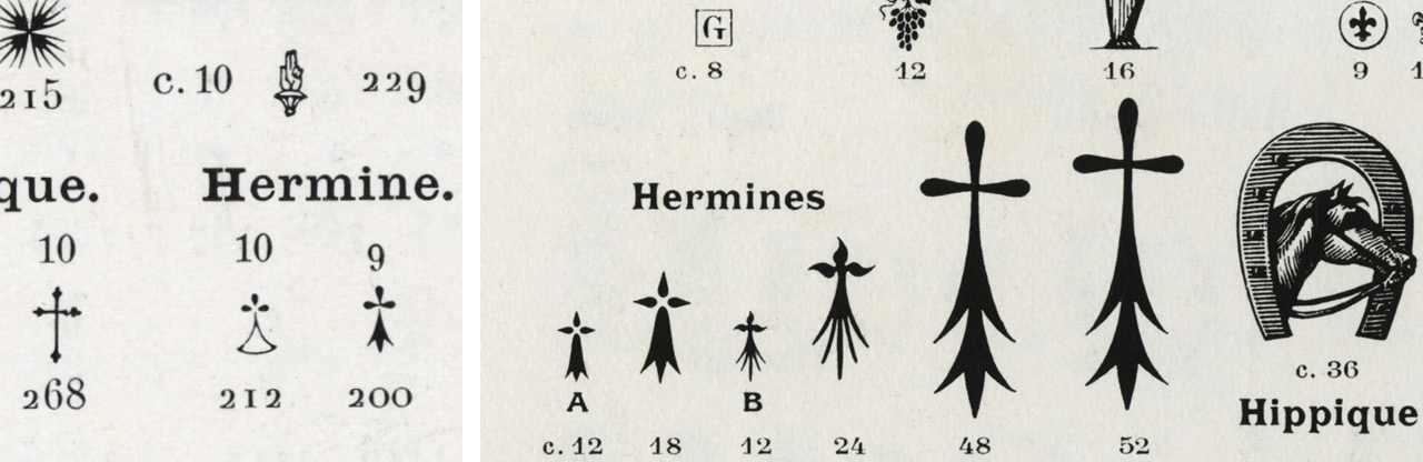
 Fig. 5 — Spécimen de la fonderie Ad. Bertrand, 1890 (Bib. Forney) ; xxxxxxx
By leaving the rules of heraldry, the ermine acquires a rare quality: it no longer consists of a model to be reproduced but becomes a ductile form, a sign to be interpreted.
A Symbol Without an Owner
In the 20th century, the ermine definitively ceased to adhere to a standard. Its silhouettes became simpler or more ornate, its proportions varied, and the three clasps became points, drops, or lozenges. Like a letter copied countless times, the ermine evolved without ever losing its identity.

Fig. 6 — Classification according to the shape of the clasps. Surveys and drawings by Stéphane Hervé.
This freedom also stems from its history. Unlike many territorial symbols, no movement has managed to make the ermine its exclusive emblem. While some organizations have tried to appropriate its image, these uses have remained sporadic. From the second half of the 20th century onward, it was primarily the Gwen ha Du (Breton flag) that established itself as the main banner of Breton demands, leaving the ermine with a more discreet role and a more archaic connotation. Without a fixed age or a defined ideological affiliation, it certainly embodies Breton values, but paradoxically, these are expressed in a more consensual way than a flag.

Fig. 7 — Propaganda poster from the Vichy regime, 1943; poster commemorating the Saint-Marcel resistance group, in the presence of General de Gaulle, 1947.

Fig. 8 — Plogoff, demonstration of May 25, 1980 (Photo: Pierre Vauthey). Yellow Vest rally in Saint-Brieuc on November 20, 2018 (Photo: attributed to Brigitte Hug).
This nuance is undoubtedly one of the keys to its longevity. While the Gwen ha Du (Breton flag) unites people around a cause (one that we know far transcends "local" struggles), the ermine—though a major component of this flag—seems to navigate freely through everyday life: it accompanies associations, artisans, stadiums, communities, and small businesses, never ceasing to belong to everyone. It is perhaps this accessibility (some would call it versatility) that explains, as much as its simple design, the astonishing diversity of forms it has inspired.
A Letter of the Breton Alphabet
As it spreads, the ermine no longer simply represents Brittany: it becomes a true element of graphic syntax. Its shape replaces a letter, fits into an accent, or punctuates a word (like a small heart or a clover). More than an emblem, it functions as an additional character in the Breton visual "alphabet." In the following examples, we can appreciate the versatility of the symbol, whose vertical, flared silhouette allows it to replace an A as easily as an I, and, by twisting it sufficiently, a C or a T!

Fig. 9 — The ermine replaces a letter in many logos.
This plasticity largely explains its success. Immediately recognizable, yet simple enough to be endlessly adapted, the ermine represents a culture with just a few strokes, and perhaps at little cost. While the triskelion, an ancient and universal symbol, carries cosmic and even esoteric connotations, the ermine more prosaically offers everyone (native, expatriate, newcomer, or tourist) the opportunity to easily connect with the characteristics of a place, the vibrancy of its customs, and the temperament of its inhabitants.
Institutional identities naturally benefit from such a powerful symbol. Since the early 2000s, the Brittany Region has progressively replaced an administrative vision—a decentralized territory—with a confident and desacralized (because it is playfully distorted) ermine, while the Brittany brand, with its reuse of the Gwen ha Du stripes (here, it is the capital E that is substituted), confirms a strategy where the design of letters and historical symbols forges an unstoppable brand. It should be noted that this visual rhetoric, like the typography, is now strictly monochrome.
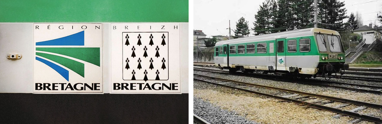
Fig. 10 — Visual identity of the Brittany Region around 1990, applied to a regional train (photo: Boris Deshayes and Marcel Bon).

Fig. 11 — Visual identity of the Brittany Region from 2005 onwards. Logotype created in-house by Fabien Picot, initially in color, then in line art in 2015. Brittany Region typeface by Xavier Dupré.
The Typographic Portrait of a Symbol
Faced with this profusion of drawings, a question arises: is there an “authentic” version of the ermine? Observing hundreds of examples leads to the opposite answer: there is no single point of origin, but rather a multitude of variations, both similar and different, yet always familiar.
This observation is the origin of this typeface. For several years, a veritable “graphic safari” led to the collection of ermines in the streets, archives, books, signs, logos, and everyday objects. Each one tells a different story of how to draw the same symbol.

Fig. 12 — Working board organizing the corpus of collected ermines.
This work is, a priori, endless, and stabilization is still under development; perhaps one day an online platform will allow everyone to create their own ermine, varying each part of the glyph's anatomy:

Fig. 13 — Proposed nomenclature, partly based on Raffig Tullou's terminology.
In the meantime, a provisional font containing 70 ermines is available upon request for anyone wishing to observe and manipulate these forms. To do so, contact us, mentioning the word "Erminig" in the subject line!
Stéphane Hervé
For further information
• Jacques Brejon de Lavergnée, « L’emblématique d’Anne de Bretagne, d’après les manuscrits à peintures (XVᵉ-XVIᵉ siècles) », Mémoires de la Société d’histoire et d’archéologie de Bretagne, tome LV, 1978, p. 83-95.
• Laurent Hablot, « Briser les hermines », Annales de Bretagne et des Pays de l’Ouest, 126-2 | 2019, 171-186. En ligne
• Divi Kervella, ‘Emblèmes & symboles des Bretons et des Celtes’, Spézet, Coop Breizh, 1999.
• Michel Pastoureau, « L’Hermine et le sinople. Études d’héraldique médiévale », Paris, Le Léopard d’Or, 1982.
• Michel Pastoureau, « L’hermine : de l’héraldique ducale à la symbolique de l’état », 1491 : la Bretagne, terre d’Europe, p. 253-264, 1992.
• Raffig Tullou, « Les véritables armes de Bretagne », Skoed evit hor bro, n°08, 1985.